

The choice of colors is not just a matter of aesthetics, because: colors communicate, arouse emotions and create deep connections with your audience. A well thought-out palette can make your brand recognized, remembered and preferred over the competition. Throughout this article, we will help you choose a strategic and emotionally effective color palette, aligned with your target audience.
Why do colors influence purchasing decisions?
Color psychology has shown that 85% of consumers choose a product because of its color, and that color improves brand recognition by 80%.
That’s why, when you choose a palette without a strategy – just because “it looks pretty” – you run the risk of disconnecting from your audience or sending the wrong message.
The following are suggested steps for choosing the right color palette for your brand
Step 1: Get to know your target audience well.
Before choosing colors, you need to know who you are targeting:
- How old are they?
- What values motivate them?
- Exactly what social media platforms do they use?
- What lifestyle do they have?
- What emotions are they looking for when choosing a product or service?
For example:
- If you sell sustainable products to conscious young people, you could use greens and earth tones.
- If your audience is modern moms, you could choose soft, warm, or pastel tones.
- For a corporate audience, blue and gray communicate trust and professionalism.
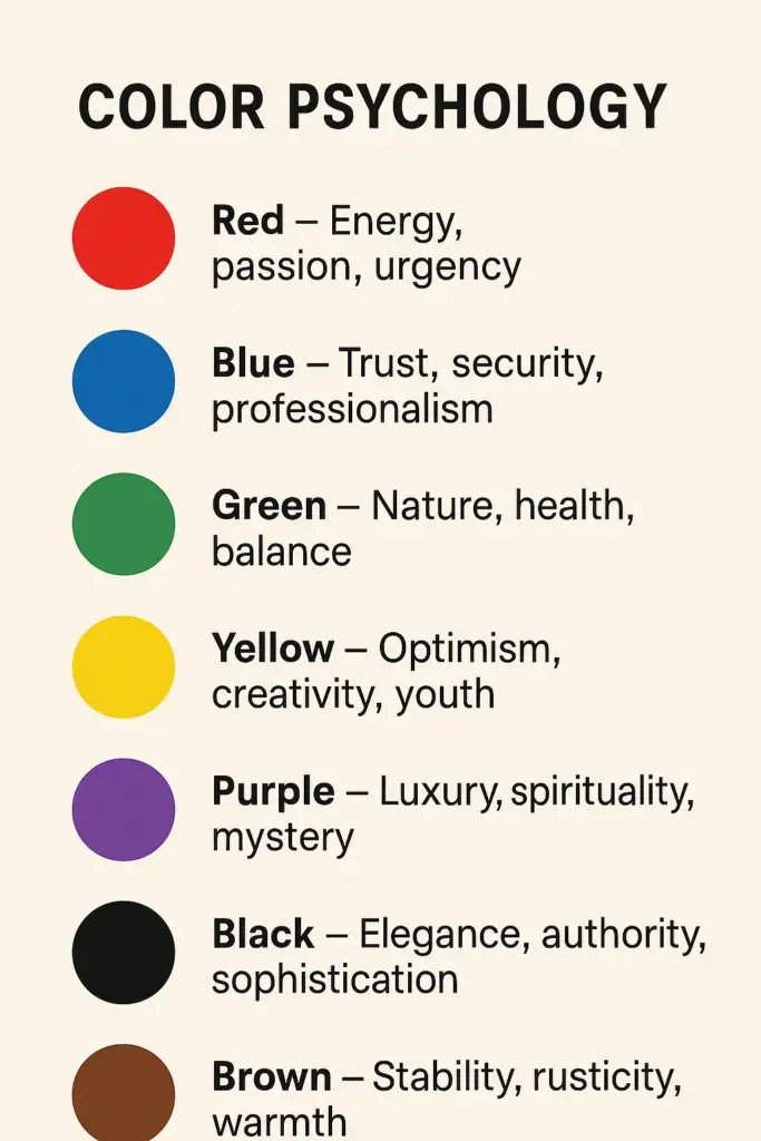
Step 2: Learn about the psychology of color.
Each color has emotional associations that influence how we perceive a brand. Here are some key examples:
| Color | Emotions/Ideas it communicates |
|---|---|
| 🔴 Red | Energy, passion, urgency |
| 🔵 Blue | Trust, security, professionalism |
| 🟢 Green | Nature, health, balance |
| 🟡 Yellow | Optimism, creativity, youthfulness |
| 🟣 Purple | Luxury, spirituality, mystery |
| ⚫ Black | Elegance, authority, sobriety |
| 🟤 Brown | Stability, rusticity, warmth |
Choose colors that align your brand’s personality with the emotions you want to generate.
Step 3: Define the role of each color in your brand.
A good color palette usually has:
- Primary color: the one that leads the identity (used in logo, website, social media).
- Secondary color: complements the primary color and adds variety.
- Accent color: used in buttons, calls to action, or highlighted elements.
- Neutral colors: whites, grays, or beiges for backgrounds and typography.
💡 Use tools such as Coolors, Adobe Color, or Paletton to experiment with harmonious combinations.
🚫 What to avoid when choosing colors
- Using too many colors (more than 4–5 can be overwhelming)
- Choosing based solely on “personal taste”
- Ignoring how your colors look on screen vs. in print
- Not checking the contrast (very important for accessibility)
🧩 Real example: how colors connect with the audience
Case: a sportswear store for young women.
🎯 Audience: active girls aged 20 to 35, modern and active on social media.
🎨 Palette used: vibrant fuchsia (energy), black (strength), white (clarity).
👉 Result: a strong, youthful visual identity with personality that generates immediate connection on Instagram and TikTok.
✨ What sets growing brands apart from stagnant ones
Choosing a strategic color palette is a crucial decision if you want your brand to connect authentically with your audience. It’s not just about aesthetics, but emotions, values, and perception.
Ready to take the next step?
At Lyon Agency, we have accompanied brands in their transformation process, building visual identities that reflect who they really are and connect with their audience.
Take a look at our portfolio and discover how a new identity can open more doors than you ever imagined.
