

In the world of branding, one of the most underrated—yet incredibly influential—elements is brand typography.
Beyond the logo or colors, the fonts you choose to represent your brand communicate style, tone, and values. In this article, you’ll discover how to choose the right typography for your brand and why this detail can make the difference between connecting with your audience… or losing them.
Why is brand typography so important?
Typography not only shapes words, it also shapes the perception of your brand.
A well-chosen brand typography:
- Reinforces your visual identity
- Communicates specific emotions
- Improves readability and visual consistency
- Helps make your brand recognizable and trustworthy
Fact: 90% of the information we process is visual, and typography directly influences how we interpret that information.
How to define your brand’s personality before choosing fonts?
Before choosing your brand font, you need to be clear about your business’s personality:
- Is your brand serious or relaxed?
- Minimalist or creative?
- Young or traditional?
👉 These answers will determine the type of font that best communicates that essence.
Example: A law firm brand should not use a handwritten font, just as a toy brand should not use a Gothic font.

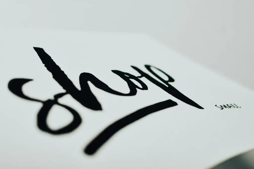
Types of brand typography and what they communicate
Here is a quick guide to the main font styles and what they tend to convey:
| Font type | Communicative personality | Popular examples |
|---|---|---|
| Serif | Elegance, seriousness, tradition | Times New Roman, Garamond |
| Sans Serif | Modernity, cleanliness, minimalism | Helvetica, Montserrat, Open Sans |
| Script/Calligraphic | Emotion, femininity, creativity | Pacific, Great Vibes |
| Display/Decorative | Originality, fun, visual impact | Bebas Neue, Fredoka |
| Monospace fonts | Technology, precision, retro style | Roboto Mono, Courier |
Some of these fonts can be found legitimately on Google Fonts.
💡 Choose styles that align with your value proposition, not just what “looks pretty.”
How to effectively combine brand fonts
A good visual identity does not use a single font. Ideally, your brand typography system should have at least:
- A font for titles (eye-catching, with character)
- A font for body text (legible and neutral)
Recommended combinations:
- Playfair Display + Lato
- Raleway + Open Sans
- Merriweather + Source Sans Pro
Maintain consistency between fonts and avoid using more than 2 or 3 different ones. Visual clarity generates more confidence than “disorganized creativity.”
Common mistakes when defining brand typography
Avoid these common mistakes if you want your brand to look professional:
- Choosing fonts based solely on personal taste
- Using fonts that are difficult to read or overly decorative
- Constantly changing fonts on social media, presentations, or websites
- Not considering the mobile and digital experience
- Downloading unlicensed or poor-quality fonts
Brand typography is your visual voice
Just as a brand has a verbal tone of voice, it also has a visual voice, and typography is a key part of that.
Well-defined brand typography consistently communicates who you are, strengthens your image, and improves your connection with your audience.

Does your brand need a font that speaks for you?
At Lyon Agency, we help you choose and combine brand fonts that not only look good, but also communicate with intention and personality.
📩 Request a free consultation and take your brand’s visual voice to the next level.
