

Introduction: Landing Page UX Is the New Currency of Online Growth
In 2025, attention is shorter, competition is higher, and users expect instant clarity and trust when landing on a webpage.
Your ads, content, SEO, and social media can drive traffic…
But your landing page UX decides if that traffic converts — or disappears.
And here’s the truth:
A beautiful landing page is useless if the user experience is confusing, slow, or overwhelming.
This guide breaks down exactly how to optimize your landing page UX to improve conversions, trust, and user engagement.
1. Start With a Clear Value Proposition (Users Decide in 3 Seconds)
When users land on your page, they ask one question:
“Is this relevant to me?”
Your landing page must answer this instantly.
A strong value proposition includes:
- What you offer
- Who it’s for
- What problem it solves
- Why it’s better or different
Example:
“Smart invoicing for freelancers — get paid 3× faster with automated billing.”
Clear. Direct. Benefit-focused.
If users don’t understand your offer, they won’t scroll.
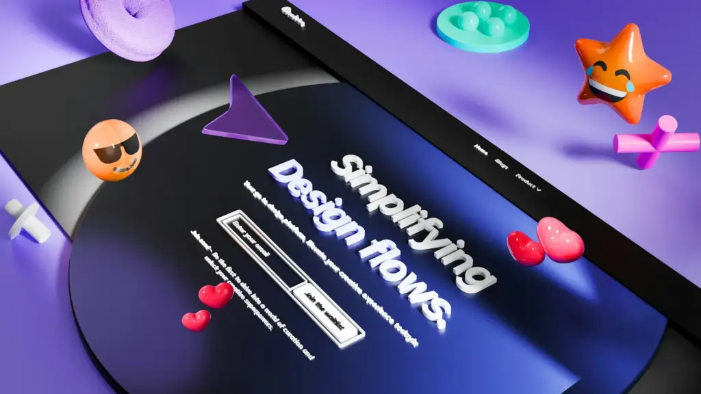
2. Optimize Your Above-the-Fold: Make the First Impression Count
Most visitors do not scroll unless the first screen engages them.
Above the fold should include:
- A headline that communicates value
- A short, supportive subheading
- Your main CTA (Book a Demo, Try Free, etc.)
- A relevant visual (product screenshot, illustration, or hero image)
- Social proof if possible
Avoid clutter — simplicity increases conversions.
3. Reduce Cognitive Load: Keep the Experience Effortless
Landing page UX must guide users, not overwhelm them.
Reduce cognitive load by:
- Using simple language
- Keeping layouts clean
- Breaking information into sections
- Highlighting only one primary action
- Removing anything that doesn’t help conversion
If your landing page makes users think too much, they won’t convert.
4. Use Persuasive Visual Hierarchy (Guide the Eyes)
Visual hierarchy determines what users see first, and what they understand fastest.
Use:
- Larger typography for key messages
- High-contrast buttons for CTAs
- Whitespace to separate ideas
- Bold colors to highlight value
- Clear headings and subheadings
Hierarchy = clarity = conversions.
5. Build Trust With Social Proof (Show, Don’t Tell)
Users are more skeptical than ever.
Social proof reduces risk and increases confidence.
Effective forms include:
- Testimonials
- Client logos
- Case studies
- Reviews
- User numbers (“Trusted by 10,000+”)
- Before/after results
Trust is a conversion accelerator.
6. Improve Mobile UX — Most Users Will Land on Mobile First
In 2025, mobile-first isn’t optional.
Key mobile landing page UX tips:
- One-column layout
- Thumb-friendly buttons
- Reduced text
- Sticky headers or sticky CTA
- Fast loading
- Avoid popups that block content
If your landing page isn’t optimized for mobile, conversions drop instantly.
7. Use a Single, Clear CTA (More Choices = Fewer Conversions)
One of the biggest UX mistakes on landing pages is offering too many options.
Your landing page should have:
- One primary CTA (repeated throughout)
- Optional secondary CTA only if needed (example: Learn More)
The CTA must be:
- Visually prominent
- Action-oriented
- Benefit-focused
Bad CTA: “Submit”
Good CTA: “Start Your Free Trial”
8. Reduce Form Friction: Only Ask for What You Need
Forms are conversion killers if they feel long or complicated.
UX best practices for forms:
- Ask for the minimum number of fields
- Use inline validation
- Avoid dropdowns when a text field works
- Make the form mobile-friendly
- Use conversational microcopy
Shorter forms = higher conversions.
9. Speed & Performance: Faster Pages Convert Better
Page speed is a UX factor AND a conversion factor.
Slow landing pages increase bounce rate dramatically.
Improve speed by:
- Compressing images
- Removing unused scripts
- Preloading key assets
- Using a modern hosting stack
- Optimizing fonts
In 2025, speed = trustworthiness.
10. Use A/B Testing to Optimize UX Over Time
UX isn’t guesswork — it’s data-driven.
Test:
- Headlines
- CTAs
- Hero images
- Layout variations
- Form length
- Value propositions
- Color contrast
The best landing pages evolve constantly.
Conclusion: UX-Driven Landing Pages Win in 2025
Your landing page isn’t just a design piece —
it’s a system built to create trust, reduce friction, and guide users to take action.
When you apply strong UX:
- Clarity increases
- Trust improves
- Friction disappears
- Conversions rise
- Customer experience becomes memorable
Your landing page becomes a powerful growth tool.
🎯 Want a High-Converting Landing Page?
At Lyon Agency, we design modern, conversion-focused landing pages grounded in powerful UX principles.
OR
See our landing page portfolio
Let’s turn your traffic into results.
